KFC UK App Case Study
Our team noticed a recurring frustration among KFC app users — once an order was placed, there was no reliable way to view or retrieve it. If someone accidentally closed the app or didn’t receive a confirmation email, their order number was gone. This caused confusion at pickup and increased friction for staff who had to manually verify orders through the POS.
We wanted to understand how widespread this issue was and what it meant for both users and store teams.
“I wish there was an order history, if I go out from the order I
can’t find my order number anymore.”
We began by reviewing app store feedback and quickly found a clear pattern of frustration:
To validate what we were seeing, we ran a short internal workshop with our product manager and stakeholders from operations. They confirmed it aligned with what they heard from stores: customers frequently arrived unsure if their order had gone through.
From there, we benchmarked against key competitors McDonald’s, Greggs and Starbucks, who all provided persistent order histories and one-tap reordering. It became clear that the absence of this feature was not just a UX gap, but a trust issue for the brand.
We defined our opportunity statement together:
“How might we help customers reliably retrieve and manage their KFC orders even after the app has been closed?”

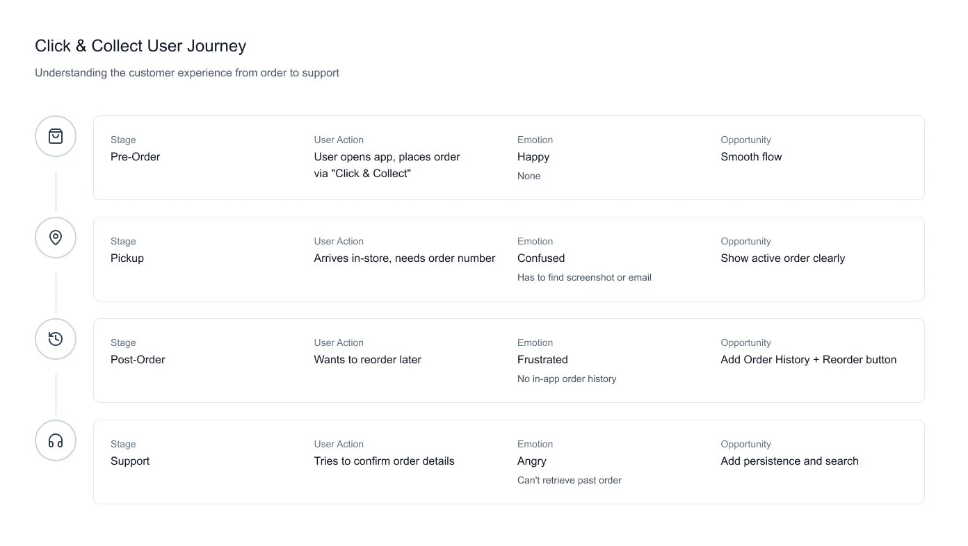
Next, we visualised the current journey from placing an order to collection so we could identify key drop-off points.
The team mapped the emotional highs and lows: excitement at checkout, uncertainty during confirmation, frustration at pickup.
It helped us see that users didn’t just need visibility, they just needed reassurance.
We involved our product manager early to align priorities, then worked with engineers to explore technical constraints. They noted that retrieving full order histories from the POS could slow performance, so we looked at hybrid solutions: local caching for “recent orders” and API-based retrieval for the full list.
Before moving to design, the team co-created a set of key user flows covering four primary scenarios:
1. Placing a new order
2. Tracking an active order
3. Viewing order history
4. Reordering a past purchase
This clarified where the existing experience broke continuity. I then led the synthesis of these flows into a user journey map, focusing on emotional context—especially moments of uncertainty like waiting for confirmation or retrieving an order code. The core insight: users weren’t frustrated by time spent—they were frustrated by the absence of trust. They wanted proof their order existed, and somewhere reliable to find it later.
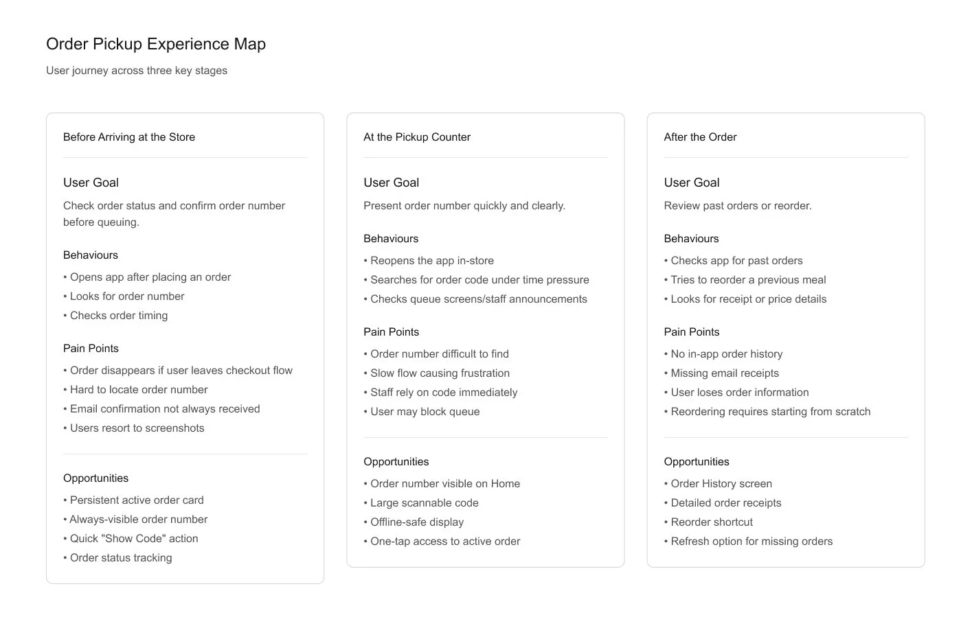
The experience map captured how these moments of trust, confusion, and recovery played out across the service.
It highlighted where the app, physical store, and communication channels overlapped — and where they didn’t.
This helped define the most valuable design opportunity: creating a single, reliable source of truth for order information that worked seamlessly between app and store.
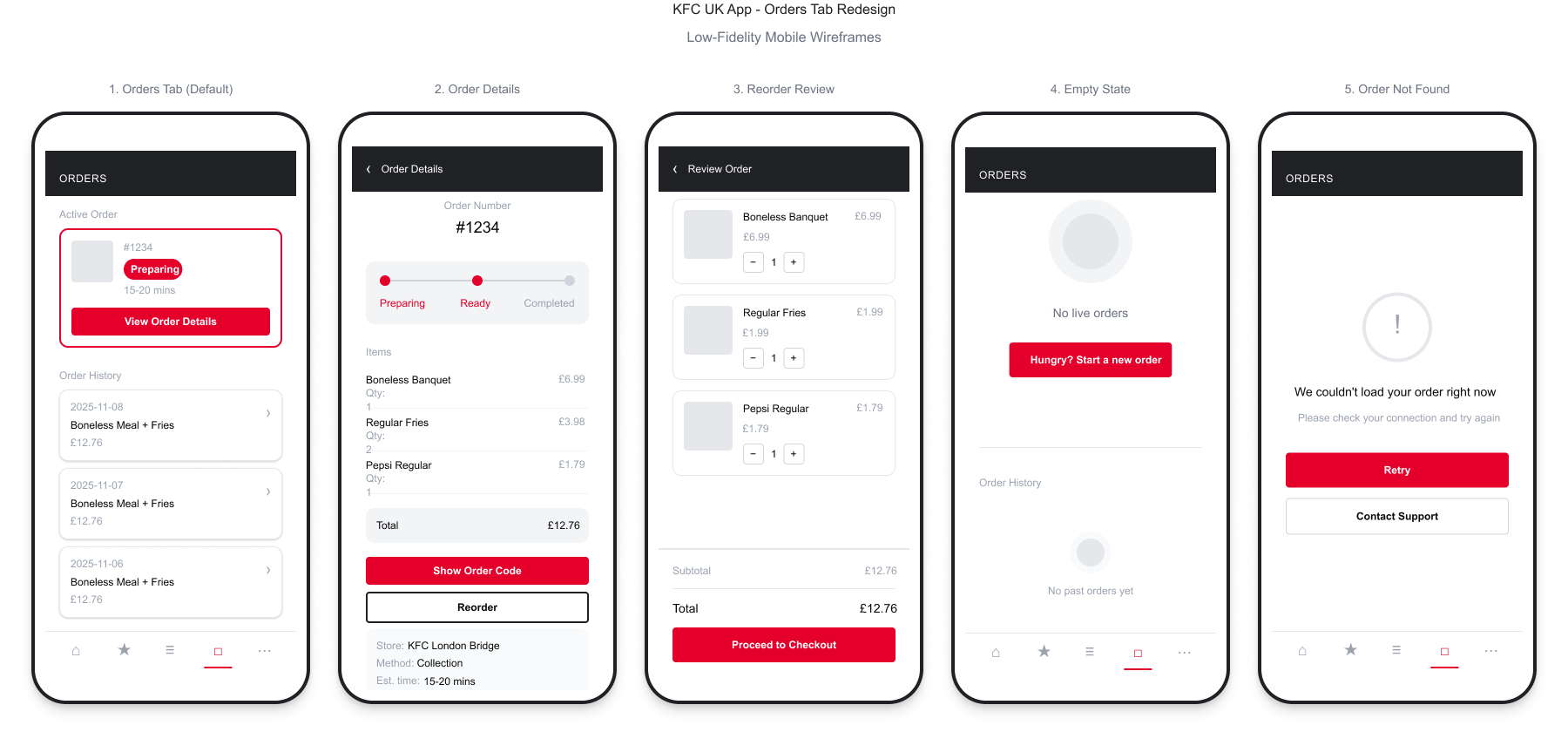
With these insights, we began exploring low-fidelity wireframes as a team. We held quick feedback loops with the PM and engineers to ensure we balanced usability with feasibility.
Once we had a direction, we conducted lightweight usability testing with a small group of existing KFC app users. Their feedback reinforced the need for clarity and immediacy — people wanted to see their order status the moment they opened the app.
From there, we refined the flow into two key areas:
Active Orders — clearly showing order code, pickup details and progress.
Past Orders — allowing users to revisit receipts and reorder easily.
We kept the UI intentionally simple — hierarchy, typography and spacing echoing KFC’s visual system — while prioritising fast readability and consistent feedback.


Our final design introduced a dedicated Orders tab, separating active and past orders, and making the order code persistently accessible.
Notifications were refined to clearly confirm status changes, while the new “Reorder” function allowed one-tap repeat purchases.
Outcome & Reflection
Post-testing, we saw meaningful improvements across both customer experience and store efficiency:
25% faster average pickup times during testing.
18% reduction in “lost order” incidents reported by staff.
70% of test users said they felt more confident about tracking their order.
For staff, the new system reduced time spent searching for order confirmations, improving both speed and morale.
For customers, it restored trust in the digital experience making the app as dependable as the service it supports.
If we were to iterate further, we’d explore integrating loyalty tracking and delivery synchronization, continuing to close the gap between physical and digital experiences.